Foundation 2.0
Inspiration
This project was motivated by our clients’ frustration to get more information from our company’s website and also the business factor of how support calls can be reduced by providing information on most common problems. This can be attributed to the fact that the old website lacked the visual cues and did little to help the user guide through the important process of deciphering the website. The website also lacked search feature which prevented users from searching solutions to their questions and instead encouraged them to call support representatives for help.
I started by talking to our clients to see what type of information they look for, how often they visit our website, how they purchase company products, etc. I also talked to our company’s client support representatives and trainers to see what kind of support calls we get, which are the most common queries that clients have, how the information on the website can help clients with their training process and so on.
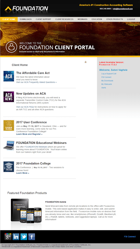
Original website design and layout
Synthesis and Ideation
Once the interviews were conducted, they were transcribed and analyzed for common themes that could be classified into overarching tags. After the tags were developed, the team brainstormed various ways in which the new website could be laid out and how the necessary information would be presented to the users. Since the old sitemap had the information arranged haphazardly across the website, the users faced problems when they visited the site to answer their questions. Also, the search feature was missing entirely from the website. This showed a clear need to reorder and prioritize information in a way that was easy for users to understand in the new sitemap and ultimately the new website. The sitemap below is one I created for the new website.
I brainstormed various ideas with the team, on the layout of information for the new website, and quickly developed rough wireframes which were then user tested with the target population. The main thing that I had to keep in mind while developing the concept for the new website was that the clients were biased in searching for information based on what steps they performed on the previous website. After rounds of iteration and user testing, a final prototype of the actual website was created which is now in development. The wireframes I developed put emphasis on hierarchy and clear communication of information which the users could access and find even in urgency. It has visual cues and CTAs to guide user through the website without feeling overwhelmed.
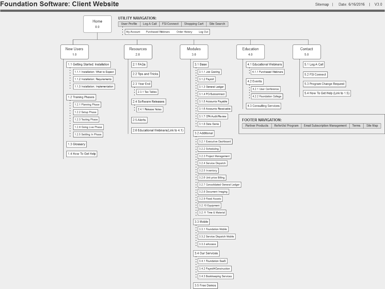
Sitemap of the new website
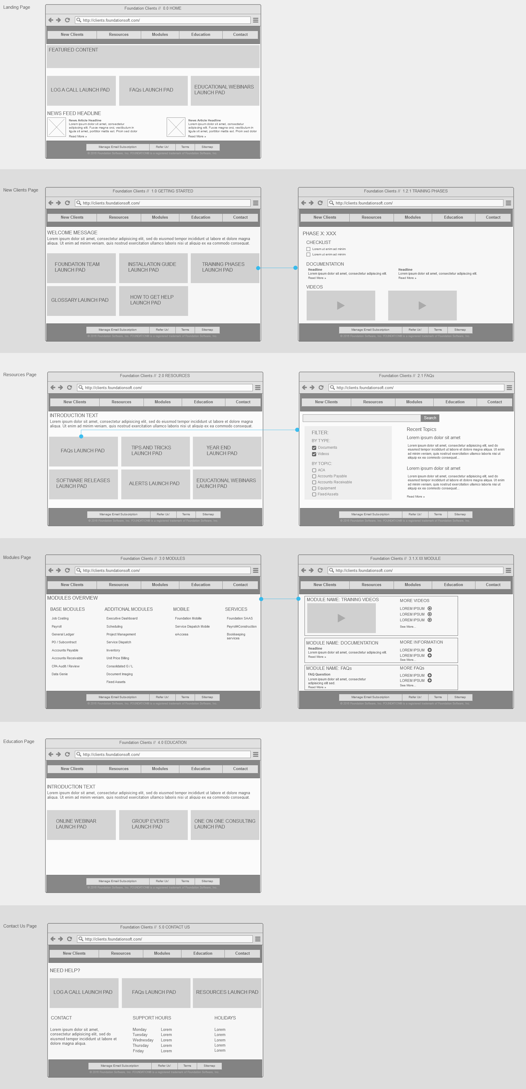
The wireframes depict the layout of information on some of the pages of the new website
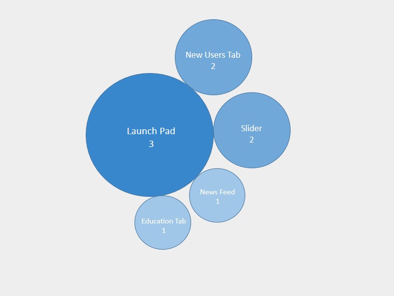
Analysis of Tag: What user see when they reach landing page
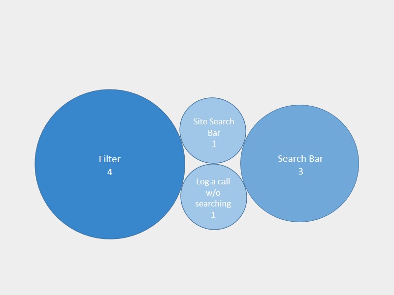
Analysis of Tag: Type of search users use first
Implementation
The implementation road map of this website will take place in two steps:
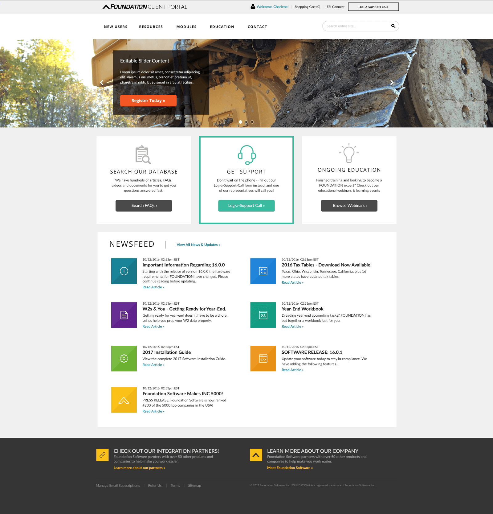
Final design of the website for Landing Page
This project was motivated by our clients’ frustration to get more information from our company’s website and also the business factor of how support calls can be reduced by providing information on most common problems. This can be attributed to the fact that the old website lacked the visual cues and did little to help the user guide through the important process of deciphering the website. The website also lacked search feature which prevented users from searching solutions to their questions and instead encouraged them to call support representatives for help.
I started by talking to our clients to see what type of information they look for, how often they visit our website, how they purchase company products, etc. I also talked to our company’s client support representatives and trainers to see what kind of support calls we get, which are the most common queries that clients have, how the information on the website can help clients with their training process and so on.

Original website design and layout
Synthesis and Ideation
Once the interviews were conducted, they were transcribed and analyzed for common themes that could be classified into overarching tags. After the tags were developed, the team brainstormed various ways in which the new website could be laid out and how the necessary information would be presented to the users. Since the old sitemap had the information arranged haphazardly across the website, the users faced problems when they visited the site to answer their questions. Also, the search feature was missing entirely from the website. This showed a clear need to reorder and prioritize information in a way that was easy for users to understand in the new sitemap and ultimately the new website. The sitemap below is one I created for the new website.
I brainstormed various ideas with the team, on the layout of information for the new website, and quickly developed rough wireframes which were then user tested with the target population. The main thing that I had to keep in mind while developing the concept for the new website was that the clients were biased in searching for information based on what steps they performed on the previous website. After rounds of iteration and user testing, a final prototype of the actual website was created which is now in development. The wireframes I developed put emphasis on hierarchy and clear communication of information which the users could access and find even in urgency. It has visual cues and CTAs to guide user through the website without feeling overwhelmed.

Sitemap of the new website

The wireframes depict the layout of information on some of the pages of the new website

Analysis of Tag: What user see when they reach landing page

Analysis of Tag: Type of search users use first
Implementation
The implementation road map of this website will take place in two steps:
- Beta version will be released in our company’s user conference for our clients to interact with and give feedback.
- Feedback from the beta testing will be used to improve the website which will be released by this year’s end.

Final design of the website for Landing Page
