Emergency Communication for First Responders
Key Design Highlights
Our iteration focused on increasing speed and accuracy of the various app features along with providing icons to the router for recognition purposes.
Literature Review
The previous iteration of app and router focused on providing the basic functionality to the users and did not focus on speed and accuracy. The features along with their design problems:

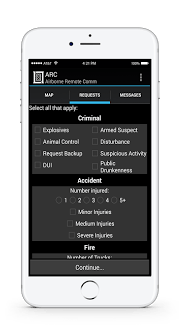
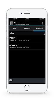
This shows the initial design of the app that was recommended before the project started
User Expectation
I interviewed 3 of 10 users from different wings of first responders namely Fire Fighters, Police Officers and EMS/EMT and transcribed 4 interviews. These interviews formed the basis of the changes made to the existing app features.
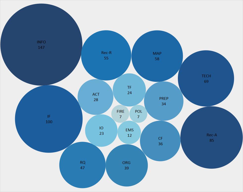
This shows the count of the tags we used for content analysis
Low Fidelity Prototype
I was tasked with creating task workflow and wireframes using paper prototype for Fire Fighters.
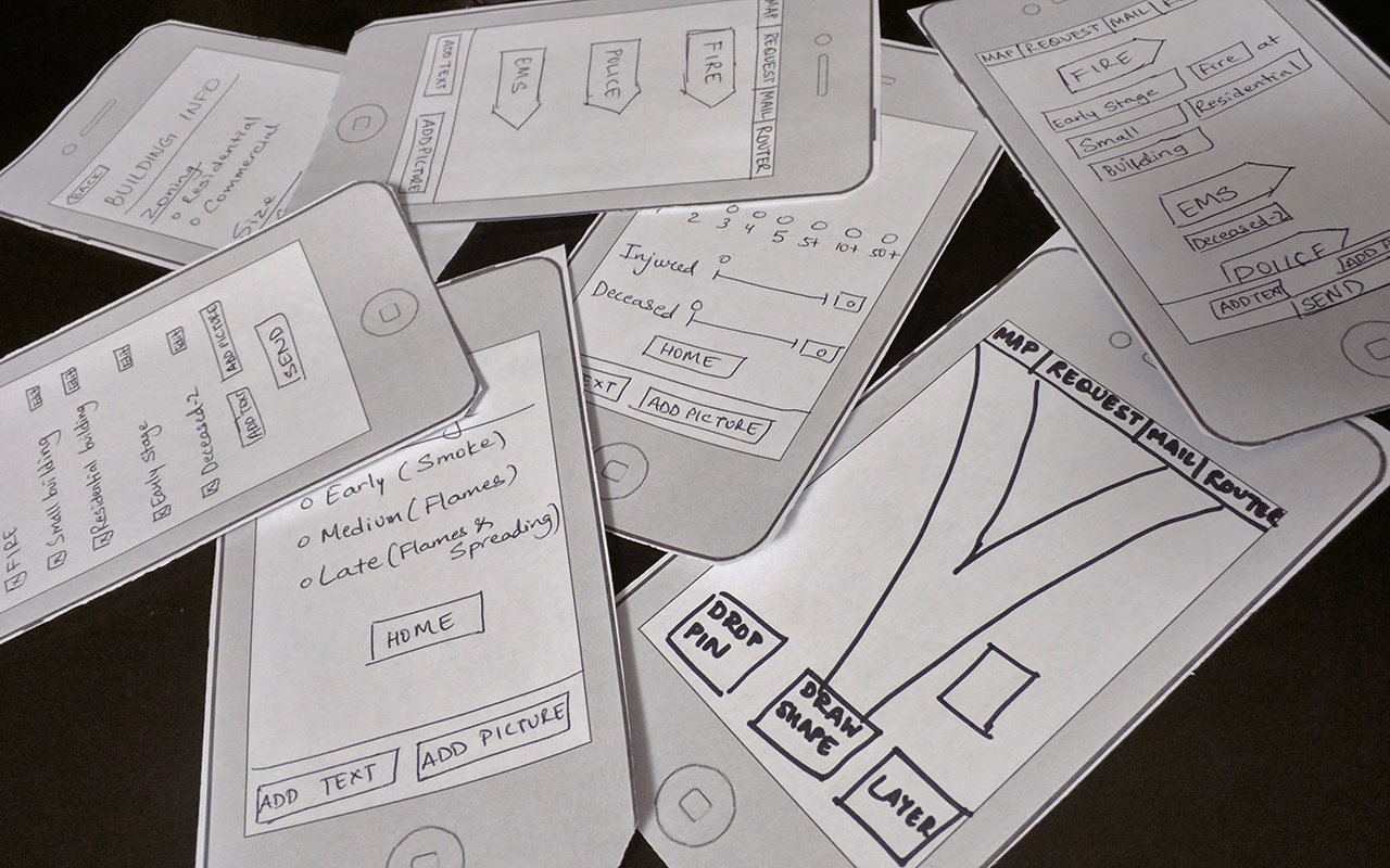
The paper prototype created to carry out user testing with first responders
High Fidelity Mockup
This consisted of developing various methods for testing the features provided in the literature review and doing its usability testing with the help of the task designed for that feature. I designed methods for inputting Review Requests and the tasks to test it.
The methods of inputting were: Sentences and List . These methods were chosen based on semantic priming and retention capability of the user. Semantic priming describes the effect of placing a word within a sentence, it increases the recognition of the word. Practically, it makes reading and understanding text faster when placed in a sentence format then in a list format (Foss 1982).
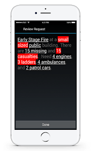
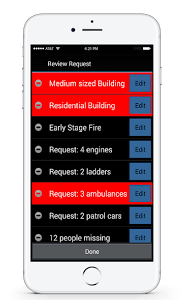
This shows the prototype of the A/B testing we did with information presented in list format or sentence format to understand which was faster and easier to read along with finding errors in the information if need be
Icon Recognition for Router Prototype
The main portion of my literature review focused on icons that can be used for speedy and accurate recognition of the devices functions. First responders must be able to quickly identify whether the router is working, its connectivity and its battery level.
Two methods used for icon recognition are: LCD Screen and Icons & Colors . Wiedenbeck showed that people were able to identify word labels more accurately and within less time than icon identifiers but that an icon-word combination is both faster and more accurate than either (1999). Kim did a multicultural study with Koreans and Americans that tested user recognition against icon abstraction. The study showed that more abstract icons are easier to identify but have a longer recognition time (2005).
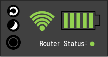
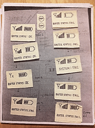
This shows the A/B testing prototype of icon recognition for various inner functions of router to correctly convey the status of the router to the first responder carrying it
Usability Testing
The working prototype of the app and icon recognition of the router was tested on combined 10 Fire Fighter, Police Officers and EMS/EMT. I designed the tasks for testing Fire Fighter taskflow, Review Requests and Icon Recognition for Router.
The task for Review Requests focuses on the participant identifying mistakes on the review form. This task answers the questions "How quickly can a first responder identify errors in the request using each design?" and "How accurately can a first responder identify errors in the request using each design?"
The task for Icon Recognition emphasized on identifying the status of the router with different displays. This task was used to answer the questions, "With which design is it easier to determine the overall status of the router?" and "What aspects of the display are hardest to understand?"
Statistical Analysis
I performed chi-square, repeated measures ANOVA and paired T test for the tasks used to test each feature. The tests were performed using SPSS. The graph below shows the result obtained for one of the task:
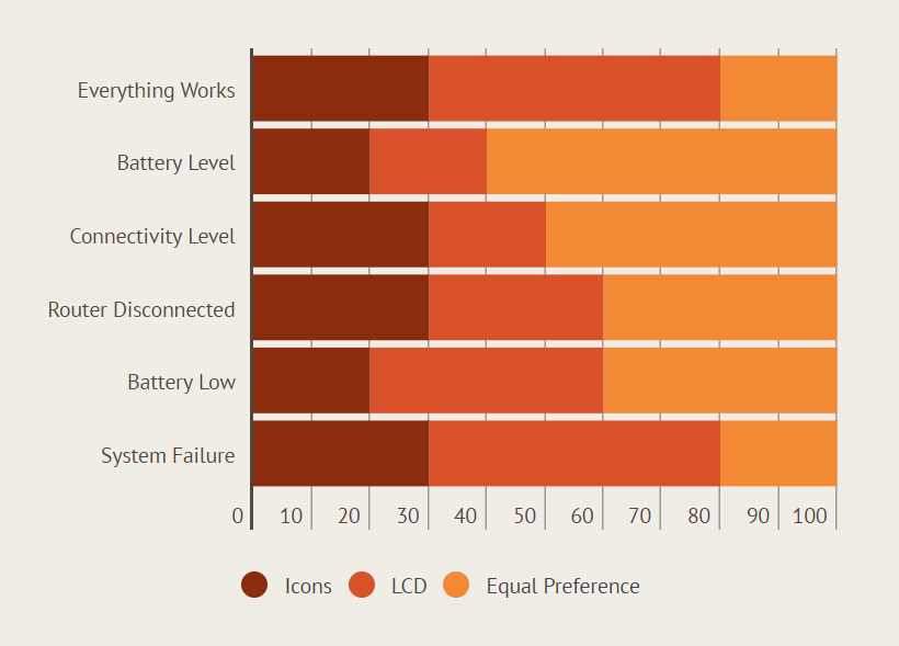
One of the results of a questionnaire that asked first responders which design they found easier to use in identifying the router status
Our iteration focused on increasing speed and accuracy of the various app features along with providing icons to the router for recognition purposes.
- Review Request : The review is in list format.
- Map Marker : Non-blocking marker with current location of the user as blue and all other markers as red.
- Map Shape : Center Radius with a preview of the shape as the user drags his finger.
- Router Display : The router interface will have LCD Screen with words.
Literature Review
The previous iteration of app and router focused on providing the basic functionality to the users and did not focus on speed and accuracy. The features along with their design problems:
- Review Request : Functionality not provided. Needed to review their requests and make edits if necessary.
- Map Marker : Consisted of dropping a pin along with its GPS coordinates. Lacked the ability to add image, text or voice note pertained to the pin. Needed when user wants to share the information with colleagues from same or different wings of first responders.
- Map Shape : Functionality not provided. Needed when user wants to mark an area for investigation or other purposes.
- Router Display : Functionality not provided. Needed when users wants to quickly identify whether the router is working, its connectivity, and its battery level.
This shows the initial design of the app that was recommended before the project started
User Expectation
I interviewed 3 of 10 users from different wings of first responders namely Fire Fighters, Police Officers and EMS/EMT and transcribed 4 interviews. These interviews formed the basis of the changes made to the existing app features.
- Based on the interviews, I and my team-mate came up with tags to code the interviews after which I calculated the frequency of each tag. The tags with the highest frequencies were given top priority when modifying the existing app for speed and accuracy.
This shows the count of the tags we used for content analysis
Low Fidelity Prototype
I was tasked with creating task workflow and wireframes using paper prototype for Fire Fighters.
The paper prototype created to carry out user testing with first responders
High Fidelity Mockup
This consisted of developing various methods for testing the features provided in the literature review and doing its usability testing with the help of the task designed for that feature. I designed methods for inputting Review Requests and the tasks to test it.
The methods of inputting were: Sentences and List . These methods were chosen based on semantic priming and retention capability of the user. Semantic priming describes the effect of placing a word within a sentence, it increases the recognition of the word. Practically, it makes reading and understanding text faster when placed in a sentence format then in a list format (Foss 1982).
This shows the prototype of the A/B testing we did with information presented in list format or sentence format to understand which was faster and easier to read along with finding errors in the information if need be
Icon Recognition for Router Prototype
The main portion of my literature review focused on icons that can be used for speedy and accurate recognition of the devices functions. First responders must be able to quickly identify whether the router is working, its connectivity and its battery level.
Two methods used for icon recognition are: LCD Screen and Icons & Colors . Wiedenbeck showed that people were able to identify word labels more accurately and within less time than icon identifiers but that an icon-word combination is both faster and more accurate than either (1999). Kim did a multicultural study with Koreans and Americans that tested user recognition against icon abstraction. The study showed that more abstract icons are easier to identify but have a longer recognition time (2005).
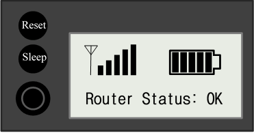
This shows the A/B testing prototype of icon recognition for various inner functions of router to correctly convey the status of the router to the first responder carrying it
Usability Testing
The working prototype of the app and icon recognition of the router was tested on combined 10 Fire Fighter, Police Officers and EMS/EMT. I designed the tasks for testing Fire Fighter taskflow, Review Requests and Icon Recognition for Router.
The task for Review Requests focuses on the participant identifying mistakes on the review form. This task answers the questions "How quickly can a first responder identify errors in the request using each design?" and "How accurately can a first responder identify errors in the request using each design?"
The task for Icon Recognition emphasized on identifying the status of the router with different displays. This task was used to answer the questions, "With which design is it easier to determine the overall status of the router?" and "What aspects of the display are hardest to understand?"
Statistical Analysis
I performed chi-square, repeated measures ANOVA and paired T test for the tasks used to test each feature. The tests were performed using SPSS. The graph below shows the result obtained for one of the task:
One of the results of a questionnaire that asked first responders which design they found easier to use in identifying the router status
